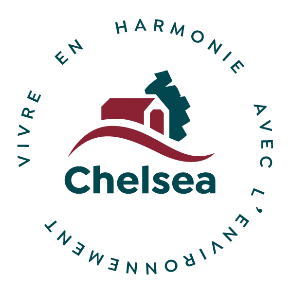
At its Council meeting on January 14, the Municipal Council adopted the update of the Municipality's official logo. The changes made to the logo are of a graphic nature and in no way affect its meaning.
The logo was updated since it often became very difficult from a graphic point of view to place the logo on certain tools due to its asymmetrical shape, which often resulted in extra work and costs. Since its meaning was still relevant and it was in no way necessary or relevant to change it, only graphic modifications were made for practical purposes and to improve its readability while maximizing its impact.
![]()
A gentle transition
To start, the logo will mainly be seen on digital tools and adapted as required for already existing printed tools. Nevertheless, no tool with the old logo will be discarded. This is to say that no expense will be spared for this upgrade and this transition will take place without an environmental impact.
How much did the logo changes cost ?
The changes to the logo cost $1,000.
What has been changed?
- The curve that represented the hill was lightly reworked and shortened and the different elements were realigned to create a good balance.
- The bridge was lightly simplified to maximize its legibility in different contexts of use.
- A rounder, more modern and warmer font was chosen and more bluish green was used to make the logo timeless and easier to use in different contexts.
A new version of the logo was also created to incorporate the municipality’s official slogan. So, you will perhaps see this format in our various tools.
This page was last updated on January 24, 2020
